Website Design in Menifee CA
“We also offer SEO services, Google Ads management, social media management, and listings management
to drive traffic to your new site.”
At KJM Digital Guy, your website is more than a digital placeholder—it’s your best sales tool. We design fast, mobile-first sites that tell your story, engage visitors, and convert clicks into customers across Menifee, Riverside, Temecula, Murrieta, and the Inland Empire.
Whether you're a startup building your brand or an established business ready for a digital refresh, we deliver website design that combines creativity, functionality, and strategy.
Ready for a site that performs? Call 855-556-3485
or message us today.
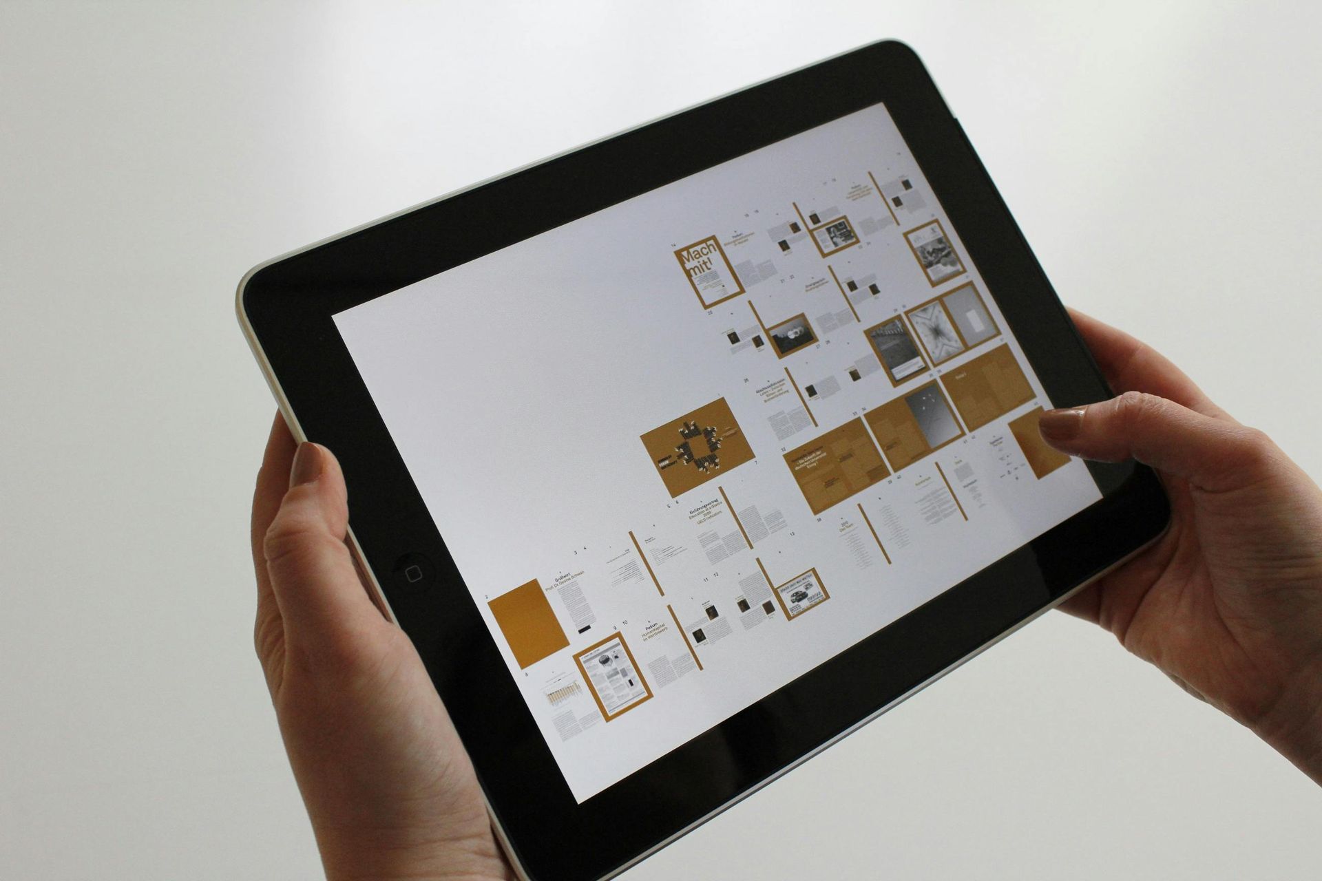
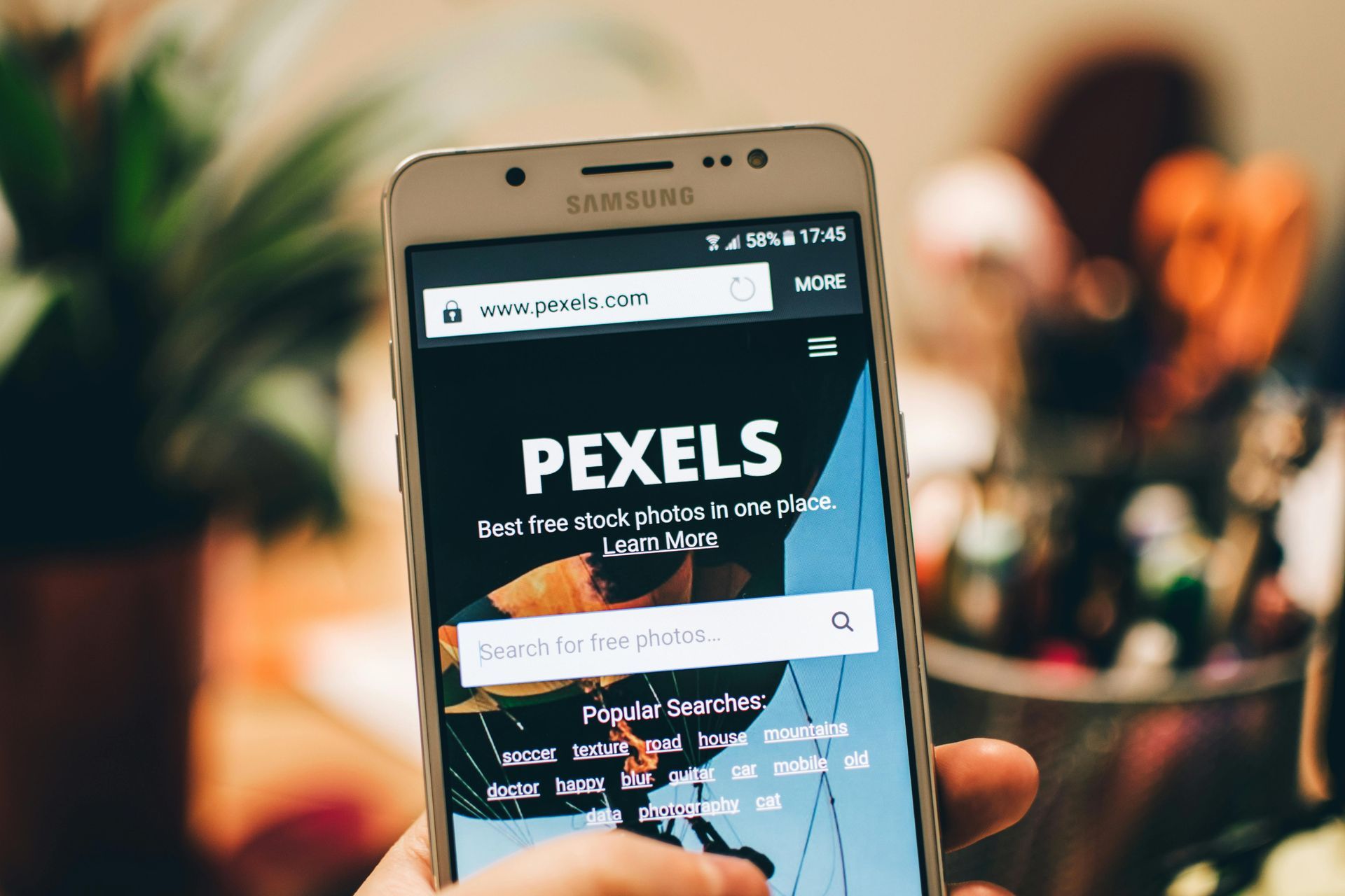
Designed for Every Screen
Today, more than half of all web traffic comes from mobile devices. If your site doesn’t look great or function perfectly on phones and tablets, you’re losing customers.
At KJM Digital Guy we build responsive websites that adapt seamlessly to every screen—ensuring your visitors have a smooth, professional experience wherever they are.
“Want more visibility after launch? Pair your site with SEO services and Google Ads management.”

Laptops

Mobile Phones
Tablets
Why Mobile-First Design Matters
- Better User Experience
No pinching, zooming, or broken layouts—just clean, intuitive browsing. - Higher Google Rankings - especially when paired with
SEO services
Mobile-friendliness is a key factor in how Google ranks your website. - Faster Load Times
Optimized for speed so users don’t bounce before the page loads. - Increased Conversions
Easy-to-navigate, mobile-optimized websites help convert visitors into customers.
What We Deliver with Our Website Design Services
- Fully Responsive Web Design
One site for every device. Your website will automatically adjust to fit smartphones, tablets, and desktops—keeping your Menifee and Inland Empire customers connected anywhere they search.
- Mobile-Friendly Navigation
Menus, buttons, and forms designed to be easily usable with fingers—not just a mouse. A mobile-friendly experience keeps Riverside, Temecula, and Murrieta visitors engaged and clicking.
- Performance-Optimized Websites
From compressed images to clean code, we ensure blazing-fast load times. Google rewards fast sites with better rankings, and your local customers are less likely to bounce.
- Cross-Device & Browser Testing
We test your site across multiple screen sizes and browsers to guarantee it performs perfectly everywhere. Your new website will look professional to customers in Menifee, Riverside, and across the Inland Empire.
Future-Proof Your Online Presence
Your customers are mobile—your website should be too. Whether you're building from scratch or upgrading an existing site, KJM Digital Guy ensures your digital presence works flawlessly across all devices.